Users
A user is defined as any individual who can log in to Mugnsoft. Each user is associated with a role that includes permissions. Permissions determine the tasks a user can perform in the system. For example, the Admin role includes permissions for an administrator to create and delete users.
Mugnsoft has built-in users, a communication user, a default admin and user.
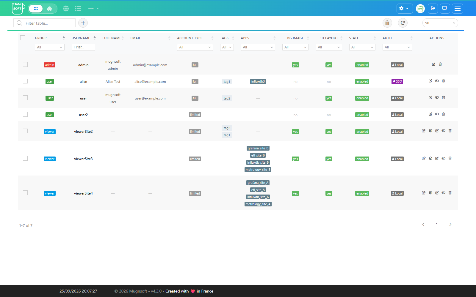
Open users from the gear menu (or #/users). Each row shows the user’s group, username, full name, email, account type, tags and apps, whether a background image and a saved 3D layout are set, the state and how the user authenticates (Local or SSO).
User Role
The user role defines the actions (add/view/delete), a user can perform on a given monitor/report/downtime.
Admin Role
Can do everything.
User Role
Can create and modify monitors, reports and downtimes. These actions are limited to the monitors he is allowed to access. Cannot change settings, create or edit new users.
Viewer Role
Can only view monitors, reports and downtimes. These actions are limited to the monitors he is allowed to access. Cannot change settings, create or edit new users.
Account type
Independently of the group, each user has an account type: full or limited. While the group defines which actions are allowed (view/edit/delete), the account type defines how much the user can extend the platform on his own:
| Account type | Behavior |
|---|---|
full |
Can create new tags on the fly (the tag selector accepts new values), and can create reports and downtimes even without the admin group. |
limited |
Can only pick from existing tags. The add report and add downtime buttons are hidden unless the user belongs to the admin group. |
Use limited for consumers of the platform (dashboards, reports readers) and full for team members who actively manage their own monitors, reports and downtimes.
Access perimeter: tags and apps
Two fields on the user profile define what data the user can see:
- Tags — tags are associated with monitors and determine the monitors a user can access. Admin users have the ability to add or remove tags from a user’s profile. A user profile can have one or more tags, which can be added or edited by simply modifying the user profile.
- Apps — application names. A user with apps assigned sees those applications and their monitors on the application dashboards (
/app, 3D plane) in addition to what his tags grant.
Tags are lower case. A new tag is stored in lower case wherever it is created — the tag selector, the API, an import or a registering component — so Prod and prod are one tag. A tag that already exists keeps the spelling it was stored with: typing it in another case selects that tag instead of creating a second one.
An application created by a Sentinel Agent carries its own name as a tag (in lower case). That tag is offered by the tag selector: add it to a monitor to make the monitor part of the application.
The effective perimeter is the union of tags and apps. A non-admin user with no tags and no apps sees no data at all — the UI shows “You don’t have access to these data. Please contact your admin”. Users in the admin group always see everything, regardless of tags/apps.
Profile display preferences
Each user profile also carries personal display preferences. Admins can preset the 3D plane view defaults when adding or editing a user; every user can adjust his own preferences at any time by clicking his avatar (top-right corner) to open his profile. The profile also holds the user’s picture and interface language: see Your profile.
3D plane view
Layout defaults for the immersive 3D dashboard (apps 3D plane):
| Parameter | Description |
|---|---|
| Max Apps/Row | How many application tiles per row on the 3D plane (default 6). |
| H-Spacing | Horizontal spacing between tiles (default 5). |
| V-Spacing | Vertical spacing between rows (default 15). |
| Alerts banner | Scrolling ticker of non-OK items along the top of the 3D dashboard: None, App banner (apps only) or App + Monitor. |
| Dark mode | Dark background theme for the 3D dashboard. |
| Background image | Custom PNG/JPG image shown behind the 3D dashboard, with a display scale (10–500%). |
| Auto-scale to fit | Sizes the background image to the applications rectangle in the 3D view. While it is on, the manual Scale value is ignored. |
List view
Default layout of the Applications (/app) and All monitors (/all) list pages. These preferences are personal — each user sets them from his own profile (avatar → profile).
Default view is a single choice, not a set of independent toggles: the page always opens in exactly one of these modes. The chooser is the same segmented control that sits in the page toolbar, so what you pick here is simply the mode the page starts in.
| Default view | /app |
/all |
Description |
|---|---|---|---|
| Compact | ✔ | ✔ | Densest grid — smallest cards, most items on screen. On /app each card ends with a thin status-over-time strip for the page’s time window; hover the card for its monitors and a full-size strip whose segments show status, duration and start → end. |
| Standard | ✔ | ✔ | Standard cards (default). |
| Detailed | ✔ | — | More information per card. |
| Weather | ✔ | — | Simple, non-technical status view: one weather icon per application (sun = healthy, thunderstorm = outage, …) — detailed below. |
| Table | ✔ | ✔ | Sortable, paginated datatable instead of cards. |
| Parameter | Description |
|---|---|
| Sort by | Default sort order: Health (worst first) or Name (alphabetical). Configurable separately for /app and /all. |
Weather view (/app)
The weather view replaces the technical application cards with one status tile per application, designed for wall displays and non-technical viewers:
- A “Needs attention” summary bar counts applications per status, worst first. Clicking a count filters the grid to that status; clicking it again clears.
- The ? button opens the status legend (healthy / warning / degraded / outage / emergency / maintenance / unknown).
- The toolbar search box and the sort chip (
by name/by health) apply to this view as well, so the same filtering habits carry over from the card views. - Clicking a tile opens that application’s report.
Edit a User
Click the pencil of the user’s row. The form opens with three areas:
- Account — username, full name, email, Language (the interface language of that user, see Your profile), Group (admin / user / viewer, see User Role), Type (full / limited, see Account type), Enabled, and Change Password for a local account.
- Tags and Apps — the user’s access perimeter.
- 3D plane view — the user’s display preferences: grid spacing, alerts banner, dark mode and background image.
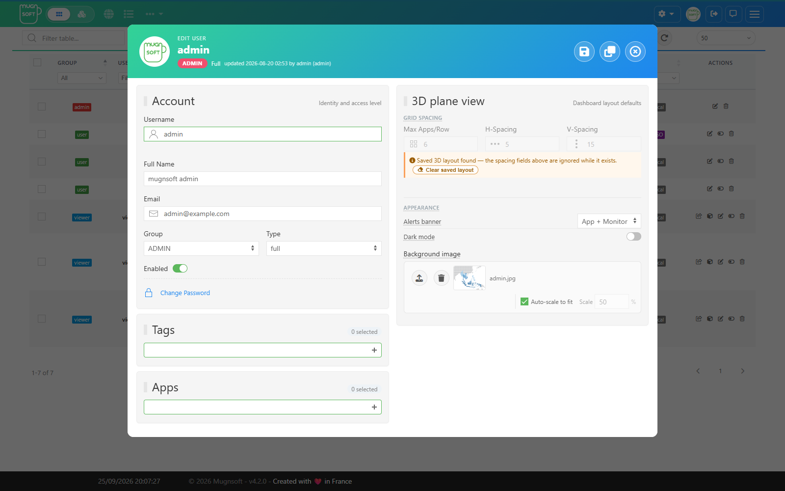
Click the disk icon to save. The header shows who changed the user last.
Add a User
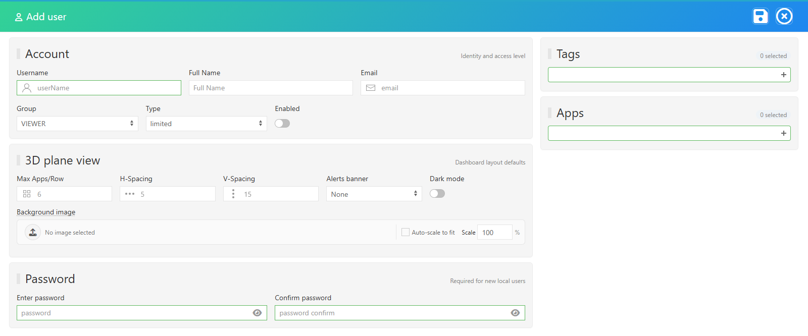
Click + next to the search box. Fill in the account, the tags and apps, and for a local account the Password and its confirmation, then click the disk icon. The user appears in the list and a notification confirms it.
Users signing in through SSO (OIDC) are provisioned automatically on their first login; their Auth column shows SSO.
Duplicate a User
Open the user with the pencil, change the Username, then click the duplicate icon next to the disk. The copy keeps the group, type, tags, apps and display preferences, and appears in the list.
Share a viewer’s status page
Rows of viewer users carry two extra actions: Share status page and Share 3D status page. Each opens a dialog with a ready-to-paste <iframe> snippet of that user’s application view; adjust the width and height and click COPY. When a Webserver-Front is configured, the link points at the Front. See Embedding dashboards.
Delete a User
Click the trash of the row and confirm with OK. To delete several users, tick their rows and use the trash button of the toolbar. The built-in admin account cannot be deleted.
Filter users
- Type in the Filter table box to match any column.
- Use the filters under the headers: group, username, account type, tags, apps, background image, 3D layout, state and authentication (local or SSO).
- The page size selector and the arrows under the table paginate it; the refresh button reloads it.