Dependency views
Two views draw the same application model: a 2D dependency map for investigation, and a 3D aerial view for a wall display. This page covers how to read each one, the search syntax they accept, and what you can do to a node without leaving the view.
Both views render the model described in App definition and data modelling: applications, the sub-applications beneath them, and the monitors each one is built from. They differ in what they are for.
| Dependency map (2D) | Aerial view (3D) | |
|---|---|---|
| Opens from | the application report, or the graph panel above it | Applications → 3D aerial |
| Best at | following one problem down to the monitor that caused it | watching a whole estate at a glance |
| Layout | computed automatically (top-down tree) | arranged by you, saved per user |
| Typical use | investigation | NOC screen, wallboard |
The dependency map
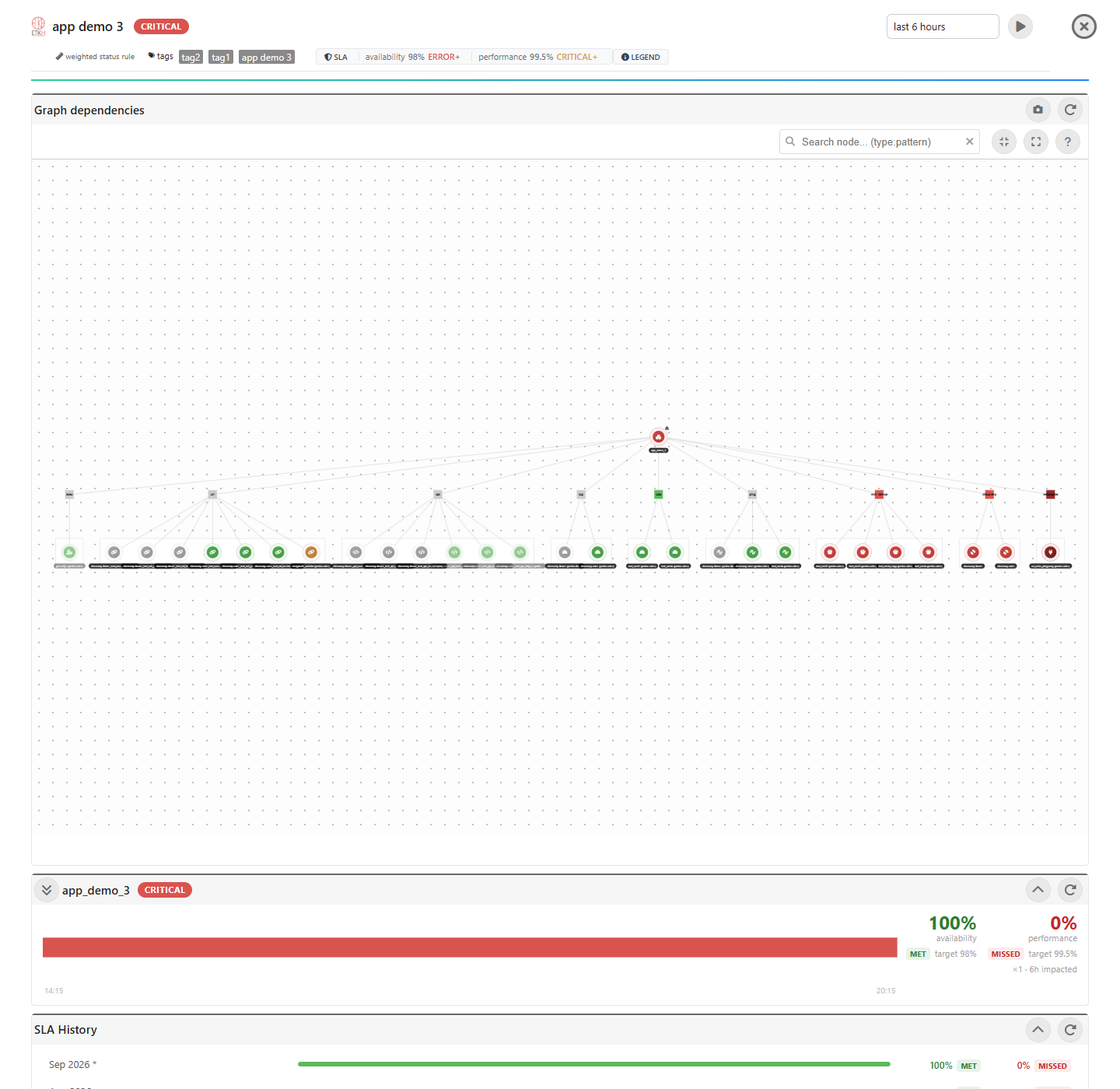
The map draws the report’s application at the top, then one node per monitor type below it, then the monitors themselves. Sub-applications nest the same way, so a tree three applications deep renders as three tiers of the same shape. Every node is coloured by its current status, not by the report window.
Expanding
The map loads lazily: an application’s monitors are not drawn until that application has been expanded. That matters because /addAppItems returns one level — an application’s own items plus its direct sub-applications — so opening one level reveals the next level’s applications but not their monitors.
- Expand all descends the whole tree, one pass per level, and lays the result out once at the end.
- Collapse all folds it back.
- Clicking a single application node expands just that one.
Searching
The search box above the map accepts a pattern, optionally scoped to a monitor type:
| Query | Matches |
|---|---|
influxdb |
any node whose name contains “influxdb” |
url: |
every URL monitor |
tcp:influx |
TCP monitors matching “influx” |
api: ping: db: sys: exec: udp: nslookup: discovery: |
the same, per type |
snmp device: / wmi device: |
SNMP / WMI devices |
app:myapp |
application nodes matching “myapp” |
Matching nodes stay lit and everything else dims. Press Esc or the ✕ to clear.
The ? button opens the same table in the interface.
Locating a monitor from the report
Each row of the application report carries a 🔍 button. It scrolls back to the map, expands whatever has to be expanded to reach that monitor, and lights the whole chain from the application down to it — so the answer to “where does this sit?” is one click, not a search.
The chain is drawn in the monitor’s own status colour: a green path ending at a monitor that is down would contradict the row it was clicked from.
Acting on a node
Right-click a node for its context menu. What appears depends on what you clicked.
On a monitor: view, edit, execute now, compute threshold, clear its historical data, enable, disable.
On an application: edit, clear historical data, enable, disable.
Disabling an application also disables what hangs below it, and the map recolours to match immediately.
The aerial view
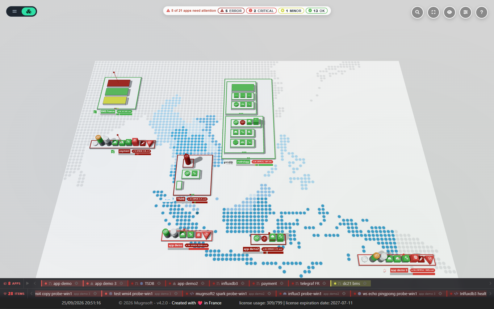
The aerial view lays every application out as a slab on a plane, with its monitors as tiles on top. It is built to be looked at from across a room.
Two ways to read it
A toggle in the top-right switches between them:
- Technical view — each application and monitor wears its exact status colour. This is the default for administrators.
- Weather view — statuses become weather icons (sun, cloud, storm) floating above each application. Friendlier for a shared screen, and the default on Webserver-Front.
The 24h availability badge
Beside each application’s name plate, the plane paints a one-line verdict on the last 24 hours:
app-payments 24h ERROR 99.87% avail
- the state word is the worst status the application reached in that window —
OK,MINOR,MAJOR,CRITICAL,ERROR,DOWNTIME, spelled with the same vocabulary as the legend, the status pills and the timelines, so one condition never appears under two names on the same screen; - the percentage is availability — the share of the window the application was not impacted — and the small
availunit beside it says so. It is a different question from the state word, and the two can disagree:24h ERROR 99.87% availdescribes an application that failed hard, briefly.
The figure carries two decimals near 100, where 99.95 and 99.90 are different promises, and none at all at exactly 100% or 0%.
The timeline strip
Under the badge runs a slim strip of the same 24 hours, drawn as the real timeline segments at their true proportional width — a two-minute blip reads as a thin sliver, exactly as it does in the application report for the same window, not as a whole coloured block. Stretches the timeline does not cover — no data, the webserver not running — stay neutral grey rather than borrowing the previous status.
Both the badge and the strip come from the same single request that builds the scene, computed server-side in one batch for every application at once, so a wide estate costs one call rather than one per application. They refresh with the scene, and sub-applications get them too.
The application popup
Hover an application’s name plate (or its logo) and the popup opens beside it. The slab itself deliberately does not trigger it — a popup covering the very tiles you are trying to inspect would be in the way. Move the cursor into the popup and it pins, which is what makes it interactive; Esc closes it, and clicking the application opens its full report instead.
The header repeats what the plane already shows, so the popup never has to be read against the scene: the name, the business-rule icon, the current status, and the same 24h STATE % avail chip and timeline strip, worded identically to the baked label. Hover a segment of the strip for its status, duration and start → end time.
Below it:
| Part | What it does |
|---|---|
| Status chips | One per status present, each carrying its count — 3 OK, 1 CRITICAL. Click one to filter the monitor list to that status; click it again to clear. |
| Monitor count | 12 monitors, which drops to the filtered count so a chip that hides fifteen rows is visibly different from one that hides none. |
| Filter box | Filters the monitor list by name or type. Esc clears the box; a second Esc closes the popup. |
| Apps | The sub-applications, when there are any. They sit above the monitor list and are never touched by the chips or the filter box — the counts only ever claimed monitors. |
| Monitors | One row each. |
| Tags | What the application is built from. |
Each monitor row reads as: a status dot, the status as a word (CRITICAL, or PAUSED for a disabled monitor), the type icon with a short type word beside it, and the monitor’s name. Colour is never the only carrier of the status.
Names are shaped the way the application report shapes its rows rather than printed raw: the probe is demoted to a muted chip and the discovery agent to a dim prefix, leaving the part that actually identifies the monitor in normal weight. A name somebody chose by hand is left exactly as it was.
With the popup focused, ↑ / ↓ walk the visible monitor rows and Enter opens the highlighted one.
The legend and the status filter
The legend, bottom-left, lists every status with its colour and its icon — so a status is identifiable without relying on colour alone. It collapses if you already know it.
Clicking a legend entry filters the scene to that status: everything else dims. Clicking it again clears the filter. The attention summary beside it counts the statuses actually present, worst first, and its entries filter the same way — the two always agree on what is selected.
Searching and focusing
The filter box accepts app: and monitor-type prefixes, and a pattern may contain spaces:
| Query | Matches |
|---|---|
app: app demo 3 |
applications whose name contains “app demo 3” |
tcp:influx |
TCP monitors matching “influx” |
app:site url:login |
both filters at once |
The camera flies to what matched; clearing the box flies back to where you were.
Double-click an application to enter focus mode: its branch stays, everything else is hidden, and the camera frames it. Esc leaves focus mode and restores the previous framing.
Arranging the scene
The layout is per user and yours to arrange:
- drag an application slab to move it, with everything on it;
- save the layout and the camera position, so the view opens the way you left it;
- upload a background image, or reset any of the three at any time.
A rolling banner across the top cycles through applications, and optionally through their monitors as well. It has three states — off, applications, applications and monitors — on the banner button.
Far from the plane, the per-monitor tiles collapse into a single status cap per application so the scene stays readable; move closer and they come back.
Accessibility
The aerial view honours the operating system’s reduced-motion setting: the banner stops scrolling by itself, the camera arrives instead of travelling, and the post-drag glide is switched off. Nothing is hidden — only the motion is removed.
A spoken summary of the scene (how many applications, and how many in each status) is exposed to screen readers and updated only when it changes.
See also
- Reading the application report — the timeline panel these views sit above
- App definition and data modelling — how applications, tags and business rules are defined
- Reading the discovery graph — the equivalent view for discovered infrastructure