Reading the application report
This section describes the application report panel — the timeline view that opens from an application — and how to read every figure in it.
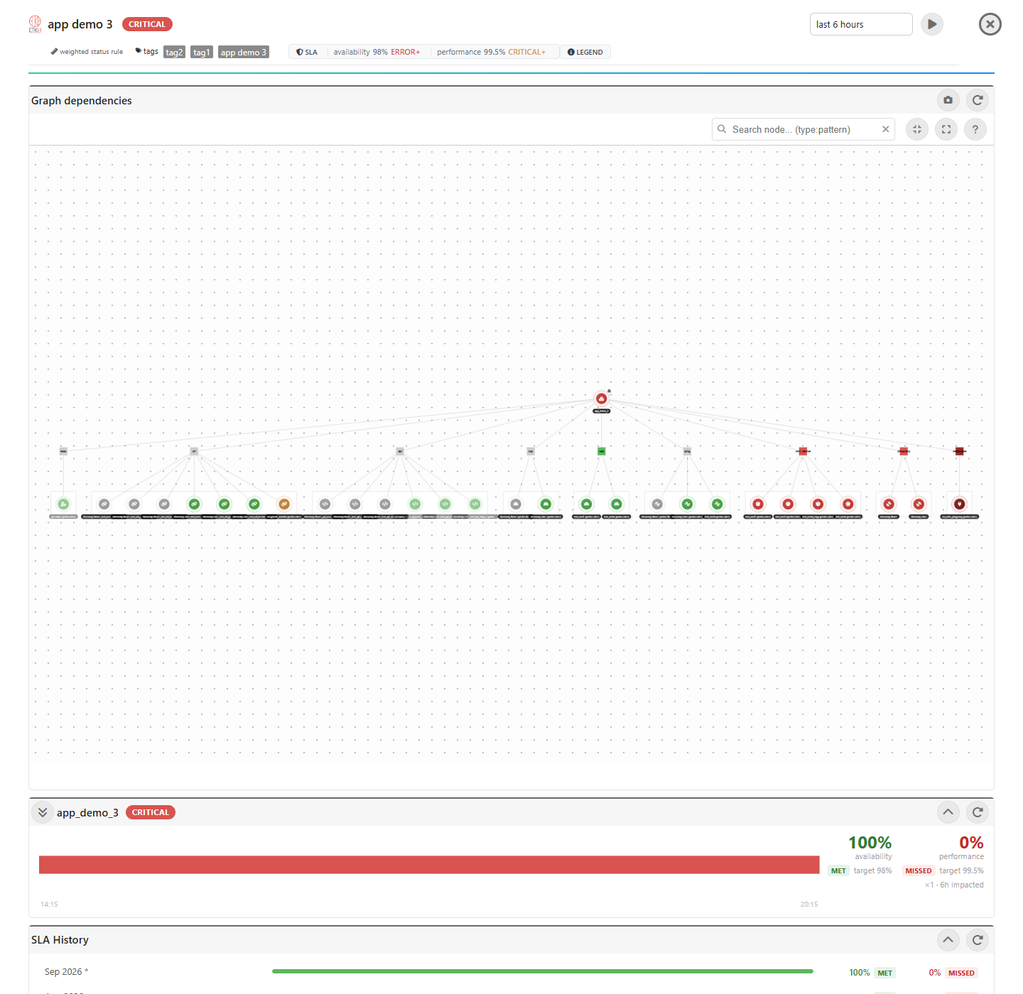
The application report is the panel that slides in when you open an application from the Applications page (or from a search result, a wallboard tile or a dependency graph node). It answers one question: over the window I picked, what happened to this application and to each of the monitors it is built from?
Everything in it describes the selected window, not the current instant — with one deliberate exception, the status badge beside the application name.
The header
| Element | What it says |
|---|---|
| Status badge beside the name | the last status actually observed in the window. On a live window that is the status now; on a custom range in the past it is the status that range ended on. It is the application status computed by its business rule — never an SLA verdict. |
| Business rule chip | which rule rolls the members up: worst or weighted. |
| Tags / applications chips | what the application is built from. |
| SLA pills | the availability target and its impact condition, and the performance ones when a performance SLA is defined. |
| Legend | opens the status legend — the same rules this page describes, one click from the report. |
| Time selector | the window every figure below is computed over, from last 30min to last 4 weeks, or a custom range. |
The SLA tiles
Two tiles report the window against the application’s commitments: availability always, performance only when one has been defined. Each carries the percentage, MET or MISSED against its target, and the error budget — how much of the allowance was spent, 0% untouched, 100% exactly exhausted, above 100% the target was missed.
Hover either figure for the working behind it: which statuses spent the budget and for how long, which ones were compliant, and what was left out of the measurement altogether.
The model behind those two numbers — targets, impact conditions, what each dimension counts and what it excludes — is described in Application definition and data modelling. Two points matter for reading the panel:
- An application with no performance SLA reports
—, not100%. Nothing was promised, so nothing is reported. - The targets are monthly, while the window is whatever the selector is set to. The tiles report the window honestly against the same target; the monthly verdicts live in the SLA History card below them.
The timeline sections
Below the tiles, one card per monitor type — URL, API, PING, TCP, DISCOVERY, and so on — plus a Dependent APPs card when the application has sub-applications. Each card holds one row per monitor.
Cards are ordered worst first, so the type with the worst problem is the first one you see. A card in which every row is OK starts collapsed; opening or closing one by hand switches that off for the rest of the session.
Anatomy of a row
discovery-win1  [probe-win1]  [Payments]   ███████░░░░░░░░░   CRITICAL · 12min
                                                              gap 2h36min · 99.02% avail
- the monitor name, with the probe that runs it and, when the monitor is linked through a sub-application rather than to this application directly, one sub-app chip per owning sub-application;
- the status bar — a strip of coloured segments over the window, one per status the monitor was in;
- the status pill — the whole row reduced to one status;
- the meta line under the pill — the gap chip and the SLA figures, when there is something to report.
How a row status is computed
The monitor’s segments are scanned once, and the first rule that matches wins:
| Pill | Rule |
|---|---|
ERROR ×2 · 5h58min |
At least one ERROR segment: the probe failed to execute the check. The duration is the total ERROR time over the window. |
CRITICAL · 12min |
No ERROR, but the bar reached a breach severity. Shows the worst severity reached (CRITICAL > MAJOR > MINOR) and how long that severity itself lasted — not the total across severities, which the pill’s tooltip gives. |
OK |
Every segment is OK. UNKNOWN gaps and DOWNTIME are ignored, never counted against the monitor. |
FAILED |
The request for this monitor’s history did not come back — a probe that is down or unreachable, not a monitor that is. |
NO DATA |
The window holds no timeline at all for this monitor. |
Every pill reads the same way: the status in capitals, ×N when it happened in more than one separate episode, then the total time spent in that status. MAJOR ×3 · 12min is three separate MAJOR spells adding up to 12 minutes — not three spells of 12 minutes each. A single episode carries no ×N.
Hover a pill for the full breakdown: how long the monitor spent in each status over the window, worst first, with DOWNTIME and no-data listed separately as periods that are shown but never counted.
The meta line
- A
gap 2h36minchip means part of the window has no status record at all — the pale grey stretch of the bar. It appears once the grey passes 5% of the window. The pill still describes the rest, so a monitor that stopped reporting halfway through can readOKand carry a large gap. 99.02% availand98.10% perfchips score that monitor’s timeline with the same formula and the same impact conditions as the tiles at the top. They are not a breakdown that adds up to the application figure — the tiles score the application’s status timeline — so read them as “which monitor spent the budget”.- Each chip appears only when it carries news. A dimension sitting at 100% is the absence of news, so an OK row usually carries no chip at all.
The section badge
The badge beside a card title is a straight tally of the row pills in it, so the two can never disagree.
- It lists every non-empty group, worst first:
error,critical,major,minor,failed,no data, thenOK— for example1 error · 2 critical · 3 no data · 4 OK. - It takes the colour of the worst group present, and rows are sorted in that same order so the problems sit at the top of the card.
- It reads
N/N OKonly when every row is OK. A monitor whose data failed to load is never folded into the OK count. - Once a card holds three or more
NO DATArows they are folded behind a single N monitors with no data in this window line, still counted in the badge.
Status colours
| Colour | Status | Meaning |
|---|---|---|
| green | OK |
Inside every threshold the monitor defines. |
| yellow | MINOR |
The monitor’s minor threshold was crossed — slow, or a soft check failure. |
| orange | MAJOR |
The monitor’s major threshold was crossed. |
| red | CRITICAL |
The monitor’s critical threshold was crossed. It answered — badly. |
| dark red | ERROR |
The probe failed to execute the check at all. Never counted by a performance SLA. |
| light orange | EXCEPTION |
The check ran and threw. Ranks with MAJOR in the pill, keeps its own colour on the bar. |
| blue | CONFIG |
The monitor is misconfigured — nothing was measured. Ranks with MAJOR. |
| pale grey | TIMEOUT |
The target did not answer in time. Ranks with MAJOR. |
| cyan | DOWNTIME |
Declared maintenance. Shown on the bar, never measured by either SLA. |
| grey | UNKNOWN |
No status record for this period. Excluded from both SLAs, like DOWNTIME. |
EXCEPTION, CONFIG and TIMEOUT are real problems but not severities of their own, so they rank with MAJOR when the row is reduced to a pill while keeping their own colour on the bar.
Reading a grey stretch
Grey is not a status the monitor reported — it is the absence of one. The report infers it from how often the source actually reported: the interval between reports is measured over the window and the day before it, and anything longer than three times that cadence is a stretch there is no evidence for.
This is what tells a stopped agent or probe apart from a failing one. A discovery agent that was shut down three hours ago has no opinion about those three hours; its bar reads grey with a gap 2h57min chip, not CRITICAL. A stretch already covered by a declared downtime is never greyed over — maintenance legitimately produces no reports, and it is a status somebody set on purpose.
The application bar works the same way, against the webserver’s own heartbeat. An application status is recomputed on the webserver’s cron, and only changes are stored, so a status that was true when the webserver stopped would otherwise stay on the bar until it came back — an application reading ERROR across a night the machine spent asleep, with the SLA charging every minute of it. Time with no webserver behind it is time nobody measured: it greys out, and it leaves both SLA dimensions on both sides of the ratio.
Narrowing the report
- Sub-app chip — click the chip after a monitor name to narrow the whole report to that sub-application’s branch. This is the only way to ask “show me everything under here” once the tree is more than one level deep. While a branch is selected the section badges count only the rows being shown.
- Drag a range on any bar to zoom every timeline to it. The pills, chips, SLA figures and section badges all re-score to the zoomed range; the status badge beside the application name does not, because it is not a figure about the window.
- The refresh icon on a card reloads that section alone.
See also
- Application definition and data modelling — business rules, weights, and the SLA model behind the tiles
- Dependency views — the 2D map and 3D aerial view the locate button jumps to
- Report operations — scheduled and emailed reports
- Downtime operations — declaring the maintenance that shows as
DOWNTIME - Events operations — the status changes the timelines are built from